


the square collection. hard edge painting

Updated: Mar 26, 2023

I created a collection of painting investigating the different color theories: Goethe, Albers, Newton, Pastoureau... and did some experience related to surface and relation with space.
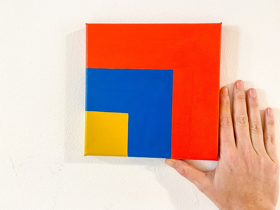
All paintings are the same surface and and I tried different color techniques such as halation, monochromatic, triadic, tetradic, complementary.
I want to translate my journey of colors through hard edge paintings and create an escape for the viewer and propose a new exit.
Each painting is a square of 20 by 20 cm, the size of my hand. The intent is to create a closer relation with painting and be able to manipulate easily in the space.
When I started this serie, I had in mind paintings that could be working individually and fit together as a mural, or puzzle.
Always interesting to see how minimal gesture and reductive choices of colors can make a different painting every time.
Always nicer to look at them together, and give them new match. they all can be hang together or with space between, every side is compatible and encouraged to play around.
Within the process, it became a brain Teaser, and I have decided that all sides should be able to mix and match.
Of course some of them would have more acquaintances than others, just like us.
We can coexist seamlessly.
About colors and edges, yes another mindscape. The confusion of negative space and borders are necessary to create a shape, that doesn’t mean it’s closed.
It's always about the grid.
On each painting, i would first draw a grid with color pencil, and divide the canvas in 9, sometimes 16, and up.
the point is to think about the surface rhythm, and always keeping mind that each edge can be working with another.
In that process, I chose to work with a reductive color palette to limit combination and find different color harmonies in one or many paintings.
It can be seen as generative art but made all analog.
I chose to define rules that can be used on small scale, and also without limitation of numbers.

Orange variation part of the square collection, different use of orange related to surface and colors juxtaposition to observe light and colors on different size and interactions.
The composition use isometric architecture on different scale and vector shapes with different colors properties to create a perspective in colorfield painting, an escape for me and the viewer.
the square collection.
Collection of 46 painting based on the same color palette.
Exploring colors influence and color theory related to surface and light.
2020.
Jessica Moritz


paintings, acrylic and pigments on canvas, 20x20 (cm) x2
Position can be changed and each sides are compatibles
this collection was on exhibition at Tiny Tiny Gallery Tel aviv 2020


tỷ lệ kèo nhà cái lúc đầu mình cũng hơi nghi ngại vì mấy trang kiểu này hay rối và toàn chữ, nên mình chỉ định lướt vài phút rồi thoát. Nhưng vào rồi mới thấy họ để bảng kèo ngay phần chính, nhìn cái là nắm được, các cột hàng canh thẳng nên đọc khá nhanh, đỡ phải đảo mắt qua lại như mấy chỗ trình bày lộn xộn; mình kéo xuống một lúc vẫn thấy số liệu thay đổi liên tục kiểu cập nhật theo thời gian thực, cảm giác giống đang nhìn bảng điểm trực tiếp hơn là bài dài lê thê. Giao diện nói chung gọn. Mấy bài có tiêu đề như “kèo nửa trận toàn…
jd88 vip mình cũng chỉ ghé thử vì thấy bạn bè nhắc hoài, kiểu tò mò xem giao diện ra sao. Vào cái là thấy trang bố cục khá thoáng, nội dung chia thành từng khối nhìn phát hiểu ngay chỗ nào là thông tin chính, không phải căng mắt đọc. Mình lướt nhanh thôi chứ không đào sâu, nhưng cảm giác điều hướng ổn: menu để khá dễ thấy nên bấm qua lại không bị lạc hay phải tìm. Mấy phần hiển thị dạng bảng cột nhìn gọn, chữ vừa phải nên đọc đỡ mỏi. Nói chung trải nghiệm kiểu nhẹ nhàng, không rối rắm như vài trang khác mình từng xem, nhất là cách họ chia khối nội…
https://kjcpro.it.com/ hôm trước thấy bạn bè nhắc nhiều quá nên mình cũng bấm vào nghía thử cho biết. Mình không đọc kỹ từng dòng đâu, chủ yếu xem họ trình bày thông tin kiểu gì. Cảm giác đầu tiên là bố cục khá dễ nhìn, chia nội dung theo từng khối nên lướt nhanh vẫn nắm được ý chính về “liên minh” này và mấy mốc phát triển. Có đoạn họ nói về bộ tiêu chí kiểm tra khá nghiêm (kiểu minh bạch với bảo mật), đọc lướt cũng hiểu họ đang muốn nhấn mạnh chuyện tiêu chuẩn. Mình thích cái cách tiêu đề đặt rõ ràng, cuộn xuống là gặp các hộp thông tin gọn gàng, nhìn sạch sẽ…